
The Issues with Website Accessibility Overlays
The Issues with Website Accessibility Overlays
You’ve heard anecdotally that website accessibility overlays can make it harder to use a site, but in this live demo, I showed the harm it caused to a real member’s website. The overlay changed the colors, typography, and backgrounds to supposedly help with visual impairment, but really they were just trying to create fake results for accessibility auditing tools. This video is a condensed version of the presentation and demo just to highlight this one issue.
Below is a corrected transcript for the video
All right. Now we’re going to get into some really fun stuff. If you’ve ever done a search on website accessibility, you’ve probably seen ads for these accessibility overlays and widgets, and they claim to fix your accessibility problems and protect you from lawsuits. Some of those prominent ones are accessiBe, UserWay, and AudioEye, but there are dozens of others. All these companies have massive marketing budgets, and they dominate the search results for anything related to website accessibility. These widgets and overlays might fix some problems, but they can’t fix everything. And as you’ll see in, in a few minutes, they often create more issues than they fix.
The Truth About Accessibility Overlays
These overlay companies make so many false claims, though, that I just can’t get into them all in this presentation. I encourage anybody who is interested to go to overlayfalseclaims.com and overlayfactsheet.com to read more about these issues from people with actual disabilities and from accessibility industry professionals. There’s even a section on one of these pages that has quotes from people with disabilities. Some of them say things like “I finally managed to gain access to my name cheap account by blocking accessiBe in my windows host file.” “It’s still a pain to even try reading the article on a mobile device because of the constant interruptions every few seconds,” and “accessiBe makes it harder to use by getting in the way of browsing and changing access barriers on a page, not by fixing them. A student and I came across an enhanced website and, to my shame, we left because navigating that mess was beyond my skill on that day.”
False Claim – You’ll Be Shielded From Litigation
Most of these products feed off your fear by stating that they’re going to protect your business from lawsuits, and they’ll shield you from litigation. The truth is despite these marketing messages of overlay vendors, their claims of legal protection have been proven false. In 2021 alone, over 200 companies have been sued despite already having purchased an overlay. Of those lawsuits, the accessiBe product was present on 95 of them on the date that the lawsuit was filed against the defendant. And, to make matters worse, adding an overlay to your site might actually run counter to end user preferences of privacy, and it can create risk of non-compliance for things like GDPR and CCPA. So in some cases, you might be worse off with these things than you are without them.
These overlay companies, they do so much false advertising, and they’re so harmful that the National Federation for the Blind lost a publicity attack on the overlay companies, accusing them of engaging in harmful practices and false advertising. They also ban the market leader accessiBe from its national convention. So again, more ammo against these things.
Affiliate and White Label Programs
All of this is made even more confusing, though, by the affiliate and white labeling programs that they offer companies and their partners. They get bloggers, agencies, and developers to publish content related to their products in exchange for affiliate revenues. And, they white label their products so accessibility agencies can sell them as their own in-house solution. So because of these programs, hundreds of new accessibility specialists have appeared almost overnight, writing articles and reselling this garbage.
UserWay Accessibility for the Visually Impaired – Making The Site Unusable
I find all these tactics dishonest and harmful to my clients, so I made a commitment early on not to take affiliate revenues or to white label products, just so I can avoid this sort of, sort of, conflict of interest.
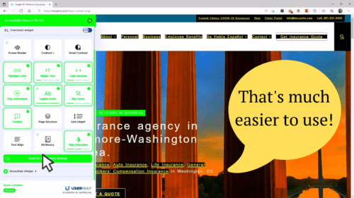
All right. Now, are you ready to have a little bit of fun? Let’s go ahead and enable the “accessibility for visually impaired” option. This is part of the UserWay overlay. Right off the bat, I’m seeing just a ton of problems here. First of all, I can no longer read the logo. I can hover over it and get the information, and that’s okay, but I can’t see the logo.
This white text that was on dark green is now white text on top of a very, very light green. So now, it’s just almost impossible to read. We’ve got these black boxes. I can’t see what any of them are unless I hover over them. It looks like I visited insurance, business insurance, personal insurance, and employee benefits.
It did a cool little HDR effect on the photo. These icons are much harder to see. Under the eerie insurance section, again, we have boxes that I can’t read at all. It made that green, a lime green, which also makes it harder to read with this white text. And again, we have these black boxes that tell us absolutely nothing. It did bring the contrast up on some of the text here. Although it left the contrast alone with some other text. We’ve got more white text on lime green.
It did an HDR-looking thing to this image. Now did stop these things from pulsing, and that’s great. And, it seemed to give us some sort of hover text. Let’s see… but they all seem to say “life” so I don’t know what’s happening there. Let’s try clicking on one. Didn’t do anything at all to this panel. A group of people playing on a playground, awesome. So it really didn’t do anything to help with this other than stop the pulsing.
It really messed up our typography here under “latest articles,” so this is actually harder to read now. And again, white text on lime green. It improved some of the contrast here on the footer. We now have light green text on a white background. That’s very difficult to read as well.
UserWay Blocks a Newsletter Signup
So that’s kind of cool. Right? Let’s go ahead and disable some of this. Wait, look at the other thing that it did. It put the UserWay widget over top of the icon that we would use to sign up for the newsletter. So we’ve now lost the functionality to sign up for the newsletter for Joseph W. McCartan Insurance. Cool. Let’s go ahead and close the accessibility widget.
UserWay’s Own Widget Isn’t Accessible
Now, this is what I find really funny, is that UserWay, which is supposed to make things more accessible, has also used this white text on lime green. And I can’t even really read half of this stuff. You know, even this button here to reset all accessibility settings is extremely hard to read and understand.
So, you know, great job UserWay!
All right, now we’re back to normal, and I can start seeing this site again. That was pretty cool. One more thing that I want to show you, and you’re going to find this really interesting, is UserWay getting in the way of other things.
UserWay Forging Accessibility Test Results
I’m going to start by opening up our WAVE testing tool. And watch what happens. Right now this is how our background looks, white text on top of the pictures, black text on white boxes. You also notice that it’s taking a long time for WAVE to load. And that’s because the UserWay script is actually jumping in and changing the site. So the UserWay script has now taken that white text on top of the background, and it’s now put a black background on top of all that. So it’s actually fudging the results of the WAVE evaluation tool.
As we go through, we’re seeing that it’s done this in a lot of places where it’s taking that white text, and it’s putting a black background on there. This isn’t doing anything at all to help accessibility, this is only helping the scores. And it’s only keeping automated testers from seeing the real results and the real issues that are on a page. So it’s quite possible that using a tool like this may actually open you up to more problems than it solves. If somebody comes through and says, “great, you’ve got all these accessibility problems, but you obviously know that they’re there, and you’re trying to just hide them.” So I would be really cautious about using UserWay for this reason. And frankly, all the accessibility tools are the same way. accessiBe is just as bad, if not worse in so many other ways.
Side By Side – With and Without UserWay
I managed to completely disable UserWay, just by blocking it on my computer. And I ran the same WAVE tool with UserWay enabled and then without UserWay enabled. With UserWay completely blocked. And you can see over here on the left with UserWay enabled, it’s done a bunch of stuff to mess with the page. We have zero errors and zero contrast errors. And then, with UserWay completely disabled, we have zero errors and about 2,500 contrast errors, as well as alerts, features, and structural elements. And you see here, we have 152 aria elements that are in use. And, when UserWay was enabled, we have 208. You’ll see that in a little bit when we go through into a deeper dive into what’s going on, it seems like UserWay may have put some aria elements in place that shouldn’t be there.
UserWay Forges Page Structure
I’ve seen several places where we have a role of heading, let’s see if I can find them again, have been set, on actual headings. We can see here’s one example where we have an element that has an H3, but it has an aria-level of two, which means that someone’s trying to fake this as a level two heading when in fact, it’s a level three element, And, the reason why they would fake it as being a level two would be to potentially make it pass a test that it wouldn’t otherwise pass.
I did check this same thing with UserWay disabled, and it failed. This aria-level two thing was actually inserted by UserWay, it wasn’t inserted by the theme or the person who developed the site. So again, we have, a place where UserWay is trying to hide a real problem. It’s trying to mask a real problem just by putting some sort of workaround in that doesn’t help anybody. All it does is try to make it pass a test.
UserWay is Opening Them Up To Liability
So the net net here is that the UserWay widget is doing absolutely nothing for JW McCarten except costing them money and slowing down the website. And in some cases, it really is opening them up to liability issues since it’s hiding the real accessibility problems.
Wrap Up and Contact Info
If you have any questions at all or want to get in touch with me, again, my name is Adam Lowe, president of peak performance digital. We have my phone number, (202) 902-6050. My website is peakperformancedigital.com. My email address is [email protected]. You can download these slides, just go to https://peakperformancedigital.com/gsscc-website-accessibility-webinar.
And, if you want a free accessibility report, which by the way, is going to be a very, short report, it’s not going to be anything nearly as detailed as this, but it will give you an overview of the accessibility problems that we have found. If you would like one of these free reports, just email me, give me your contact information, your company information, your website, and we’ll get that back out to you in one to three days. So, thank you again to everybody who attended. Thank you to Bell Flowers and Joseph W. McCarten for letting me use your websites as Guinea pigs. And I hope to talk to you all soon.
Recent Posts
-
About the Recent WordPress Drama
As many of you have heard, there is some drama in the WordPress space right now. If you haven’t heard anything yet, consider yourself lucky to have avoided the needless drama so far. In this post, I’ll cover what is happening, who is impacted, why it’s important, how we are protecting you, and some thoughts […]
-
Using Sass with Pinegrow
I recently had someone ask whether Pinegrow supports Sass, so I thought I’d do a quick video demonstration. In this demo, I show you how we activate our Sass stylesheet and how we can use a simple Sass variable to change the color of a heading.
-
Pinegrow Countdown: Day 1 – Pinegrow Plays Nice with Others
A lot of products in the WordPress space have grown in popularity, primarily because of their open and flexible ecosystem that allows 3rd party developers to create add-ons, extensions, and libraries. Pinegrow also has a great plugin API. But I’m going to show you in this video, that in most cases, you don’t even need it.
-
Pinegrow Countdown: Day 2 – Pinegrow is STILL not a Page Builder
In this video, I’m going to show you why Pinegrow is different from Page Builders so you don’t fall into the trap of trying to use it like something it’s not, only to get frustrated and give up.
-
Pinegrow Countdown: Day 3 – Frameworks in Pinegrow
Pinegrow has built some fantastic helpers for popular frameworks. In fact, when you start a new project in either Pinegrow Desktop or the Pinegrow WordPress plugin, you’ll be asked which framework you want to choose. If you are already used to using one of the built-in frameworks, the choice will be easy. If not, this little video will hopefully help you understand what the frameworks do and how you should answer those important initial questions.