Accessibility
Archives:

WordPress Menu Accessibility – Part 2: Detailed Requirements and Final Test
In this video, I do a deep dive into the requirements to make an accessible Website Navigation Menu. I test the newly released Twenty Twenty-Three theme in WordPress 6.1 and show you the specific test criteria as I go along.

More WordPress Menu Accessibility: Four More Menus Compared
By popular demand, here is a "Part 1.5" video as a follow-up to last week's WordPress menu accessibility roundup. Here, I've added practical accessibility tests for Beaver Builder, Astra, Cwicly, and Divi. Let's see how they hold up!

WordPress Menu Accessibility – 10 Menus Compared: Practical Tests
This is part one of a two-part series where I test the accessibility of 10 different menus from some of the most popular WordPress themes and Page Builders.

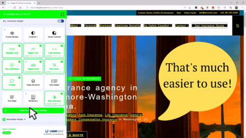
The Issues with Website Accessibility Overlays
You’ve heard anecdotally that website accessibility overlays can make it harder to use a site, but in this live demo, I showed the harm it caused to a real member’s website. The overlay changed the colors, typography, and backgrounds to supposedly help with visual impairment, but really they were just trying to create fake results for accessibility auditing tools. This video is a condensed version of the presentation and demo just to highlight this one issue.

GSSCC Website Accessibility Webinar
Thank you for attending the GSSCC Website Accessibility Webinar. We'll publish a video of the webinar along with a copy of the slide deck as soon as it's available.


